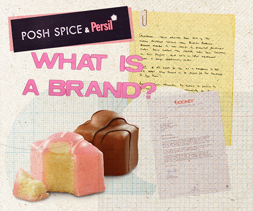
Understanding Brands Part 2 – The ties that bind, 1996

- Date: 1996
- Publisher: Marketing Business
- BRANDS
In these much-quoted features published in May, June and July 1996 Jeremy explores the basics of brands. Part 2 considers the differences between products (something that is made) and brands (something that is bought), arguing that brand success depends on a mixture of attitude and function.
Understanding Brands Part 2 – The ties that bind
Once we understand that everyone creates their own brands in their own heads in their own way, we’re half way to sanity. Now we only have to understand how they do it; and after that, we might even be able to encourage them to arrive not just at a consensus of subjectivity about our brand but even, hallelujah, a consensus quite close to the one we had actually planned for.
The way that people build brands in their heads is the way we form an impression of anything. It is an intensely creative process. We build an image as birds build nests - from scraps and straws we chance upon. We imbue everything about that brand, however trivial, with meaning and significance. We infer - all the time. We try to make consistent sense of things, because minds dislike inconsistency and dissonance. People build brands in their heads - whether or not the owners of that brand intend them to.
Stephen King identified some of the factors - just a few of the scraps and straws - that have an effect on our total impression of any brand.
And let me start with function, because I haven’t so far given it much attention.
If you present your potential public with a product that is supposed to do something, and it doesn’t - or it does it far less well than its competitors - then all the fancy footwork in the world won’t save it.
Function should never be taken for granted; function should always be under review; function is at the heart of any brand. But important as it is, it is no more than a ticket of admission to the stadium. Function entitles you to compete: but in most markets, over time, function alone will not bring sustainable success.
That which makes brands valuable to people, that which makes brands worth more, that which entitles brand owners to decent margins and a good trade presence, is a great, complicated, individually-arrived-at muddle of fact, function and feeling. It is that muddle, that blend, that synthesis that provides competitively attractive satisfactions to your ultimate users.
And each of these factors - and lots more - will have some effect on each individual’s perception of the brand in question.
Each one of these factors is filtered through the subjective screen of ME: How old am I? How poor? Do I know the brand? Did my mother use it? Does Janey use it? This internal, subconscious, self-interrogation is all part of the consumer’s creative process.
Here's a real advertisement. [Shows handwritten roadside sign advertising FRESH EGGS.]
How charming! How primitive and unsophisticated! We, professionals, find it easy to be loftily indulgent about work of this kind. Some elderly smallholder, eking out his pension, no doubt. He’ll probably manage all right if he doesn't try to expand.
But imagine if he did, and called in a sophisticated London corporate identity consultancy. It is not wholly impossible - in the interests of modernity and legibility, you understand - that they might recommend their new client to do something like this: [Shows sign saying FRESH EGGS in Helvetica typeface.]
There’s been no change of strategy, you will have noticed - nor even of copy.
They might even think it worth testing something along these lines: [Shows sign saying FRESH EGGS in a different typeface.]
Now, as I’ve repeatedly stressed, all individual responses to common stimuli are different and subjective - so I can’t be certain how each of you reading this piece may have responded to those three different advertisements. But I’m reasonably confident that most of you, and indeed most urban egg choosers, would think less well of the eggs offered in the second two advertisements than of those offered in the first.
In fact, of course, if you look back, that original advertisement is a little masterpiece of brand communication. However inadvertently, everything about it triggers the right sort of response: the meticulously hand-lettered sign (but clearly not by a professional art director); not a weed in the flowerbed; the sign not quite straight, the carefully-cut grass.
Each of these tiny triggers leads to a rich, internal, coherent composition: a small number of happy, organically-fed, free-range hens looked after personally by a compassionate owner. The word ‘fresh’ here is redundant: how could they be anything else? Whereas in the second two examples, the typography has not only decided to fight the word ‘fresh’: it has comprehensively won.
The great skill in designing brand communications is in selecting those tiny triggers, because those that are uniquely right for one brand will by definition be wrong for another. Here is another brand looking for your custom: [Shows homemade sign saying FLYING LESSONS.]
I have repeatedly said that consumers’/receivers’ interpretation of brand stimuli is creative. This sign says, factually and accurately, what service is on offer. And that’s all it says.
But what does it imply? What does it communicate? A very, very old flying instructor? A very, very old aircraft? A grass landing-strip with molehills? Decomposing World War 11 tarmac? Not much maintenance? An open cockpit? Again, each of you will have constructed a slightly different internal mental picture. But I don’t think many of you - however irrationally - would have chosen this brand. You may indeed have arrived at a consensus of subjectivity.
A bit of boring old Helvetica here would not have come amiss.
Unless you’re launching a new brand - a brand without even any declared corporate parentage - you will never be in the business of designing communications for empty heads. Each member of your audience will already have views, feelings and prejudices: and you'd better face them fearlessly.
There is still a school of business which I call the Ostrich School of Marketing and its great advantage is simplicity. You start by conducting vast quantities of research that proves incontrovertibly that the entire population believes British Rail to be inefficient, dirty, expensive and self-satisfied. This information is invaluable: not because it prompts management to do anything, but because, with an effortless inversion, it forms the basis of the creative brief. Consumer proposition: British Rail is fast, clean and caring. You may confidently look forward to a strapline suggesting, for example, that This is the Age of the Train.
If your aim is to achieve a radical change of brand reputation in the minds of your audience, be at least respectful of what’s there already.
Remember that every stimulus will have some effect on consumer perceptions: not just the advertising. Remember that your audience will not be judging you absolutely, but relatively: against their own existing feelings and - as always - against your competition.
Don’t forget the power of packs and pack designs. A pack is more than something that stands out on the shelf and can be stacked efficiently on pallets. A pack is the face of a brand. And faces tell people whether other people are cold or warm, snobbish or neighbourly, fierce or gentle. The face - the pack - can even influence the way a product is perceived to function.
Many years ago, some excellent research was done for a washing-powder. Like much good pack research, it pretended not to be. There were no tachistoscopes and no preferences sought for alternative designs. Instead, two large samples, one of users and one of non-users, were each given six weeks’ supply of two different washing-powder recipes: and they were asked to use both and report back as to which was the more efficient. Nothing else: just which, in use, was better for problem washes.
From both samples came a significant preference for the same version: Version B was clearly the more efficient. In fact, of course, the powder inside the two packs was identical, as were the washing instructions. The only variable was the pack design. Pack A had two little girls on the front and pack B had two little boys on the front.
And to those mothers, or at least to enough of those mothers, there was a clear and important distinction between boy-dirt and girl-dirt. Girls got dirty but boys got absolutely bloody filthy. It followed that any washing powder that set out to deal with boy-dirt was likely to be more efficacious. None of this, of course, happened in such a plodding manner or at such a conscious level - but that’s, in practice, as they compared the two, what those respondents found to be the case.
Part 3